Camp Brochure
⋆
Camp Brochure ⋆
the problem
For this project, I redesigned the brochure for High Adventure Summer Day Camp. The current brochure had various design problems. The colors were not chosen carefully, the brochure was composed of different typefaces, and overall, was very busy. The body copy was not spaced out correctly across the pages and this affected the readability of the text. The core user of this brochure are parents of prospective campers. The information overall and how it is laid out, may deter people from even reading the brochure. The users need to be able to easily read the material, so they can decide if they want to send their child to High Adventure Summer Day Camp. They also want to see a put together design as that could reflect the level of organization of the camp itself.


the process
To start this process, I critiqued and analyzed the current design. By starting with content analysis, I was able to make note of what technical issues the designer previously made to be sure those fixes were top priority. Competitive analysis was the next step. By using various online sources, I collected examples of brochure designs and designs for summer camps. This visual research was important for me to take the next step in the design process.
I started to sketch different layout ideas and different designs/icons I could include. The next step was to create three different compositions based on the sketches I did. These compositions included different typefaces, color pallets, and icons.
Sketches
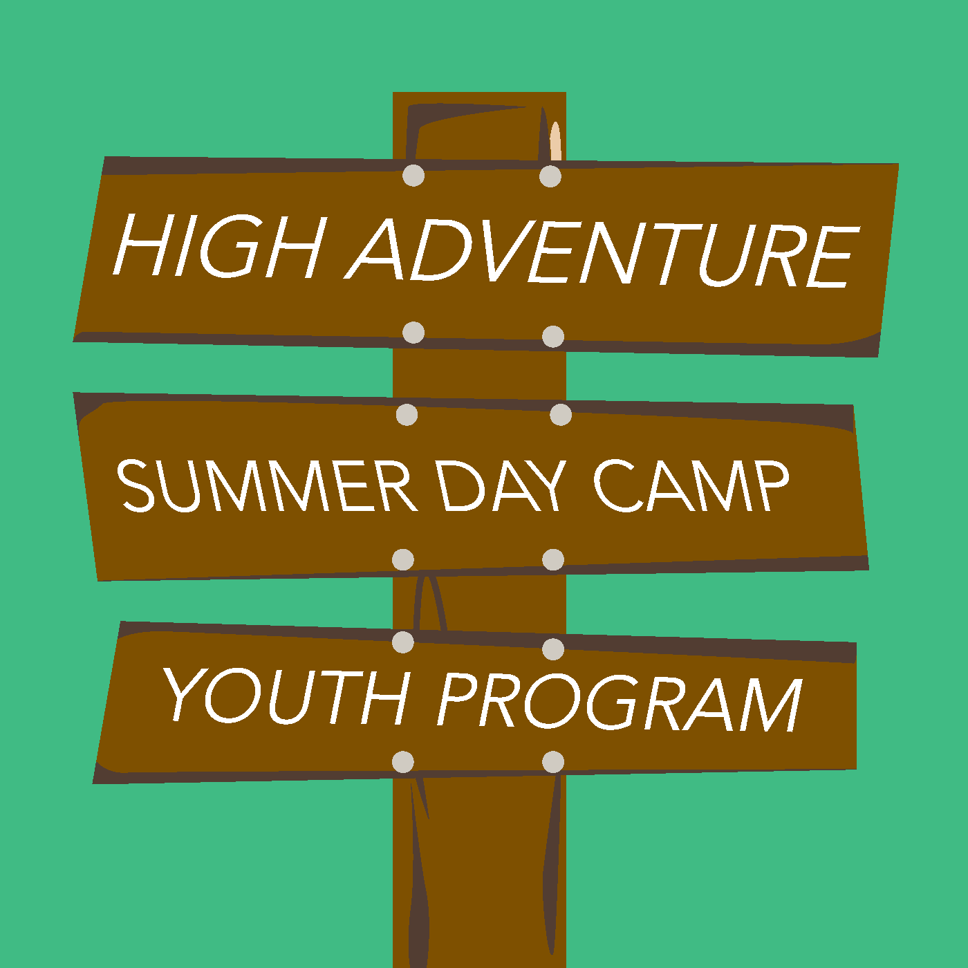
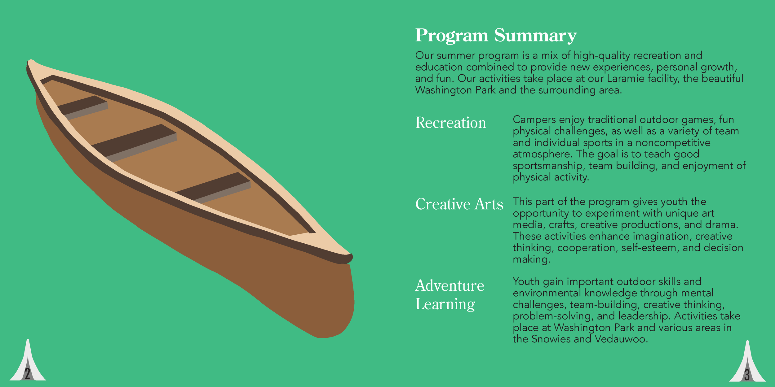
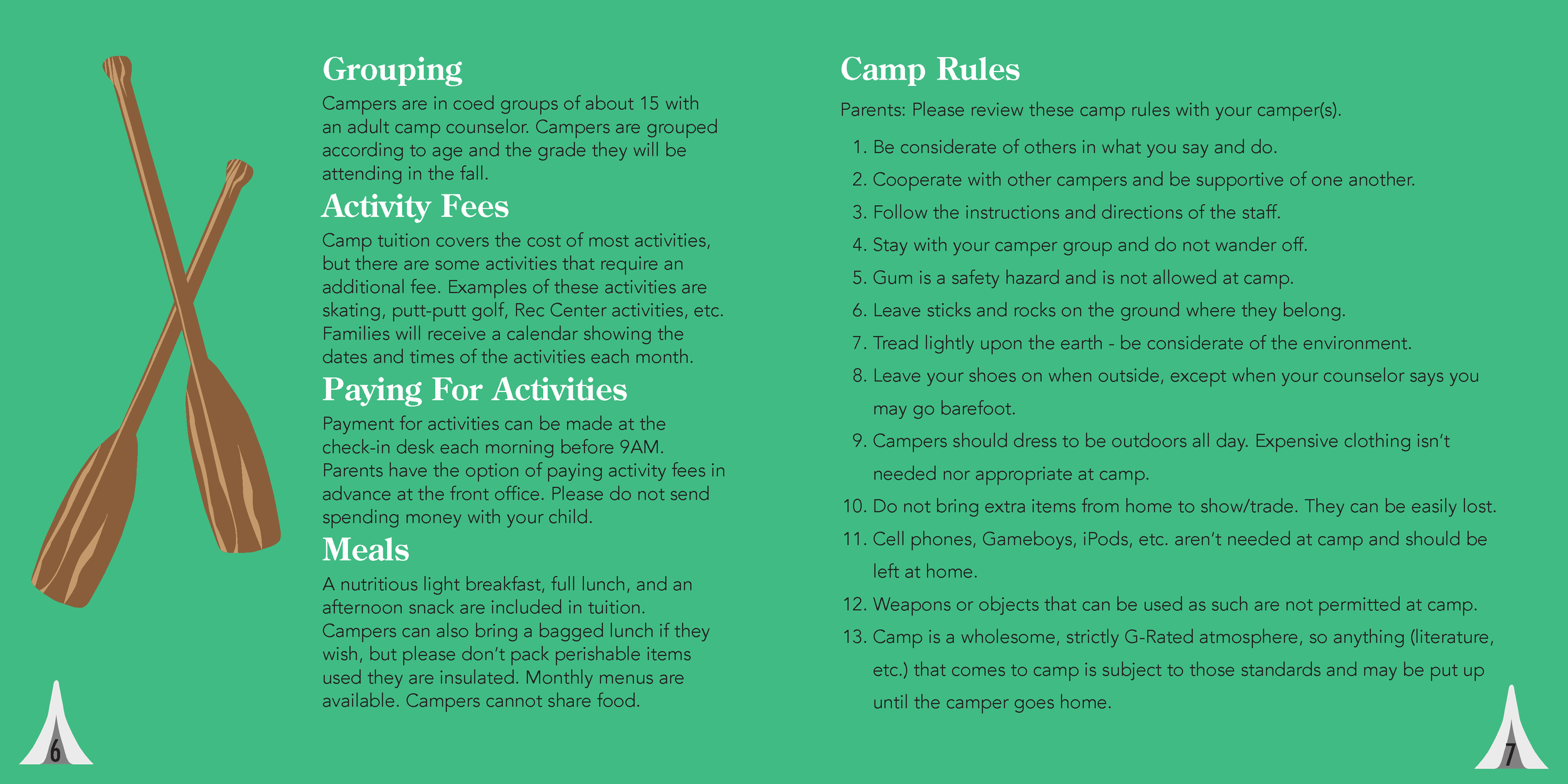
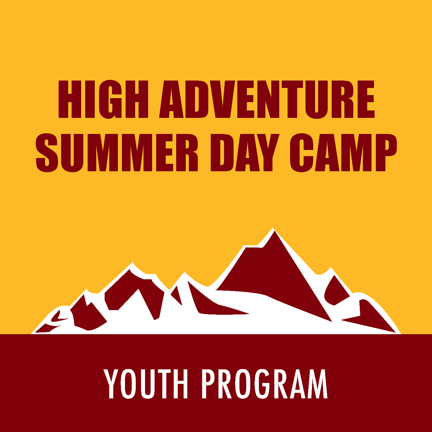
The first composition embraced the outdoor theme with green, orange, and tree graphics. The second composition also used green and included brown and wood elements. The third composition used a dark red and yellow/gold color palette. This comp included a mountain scape and trees.
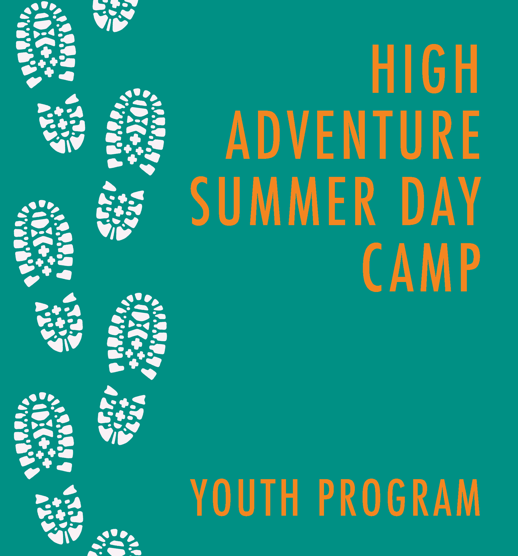
Composition 1
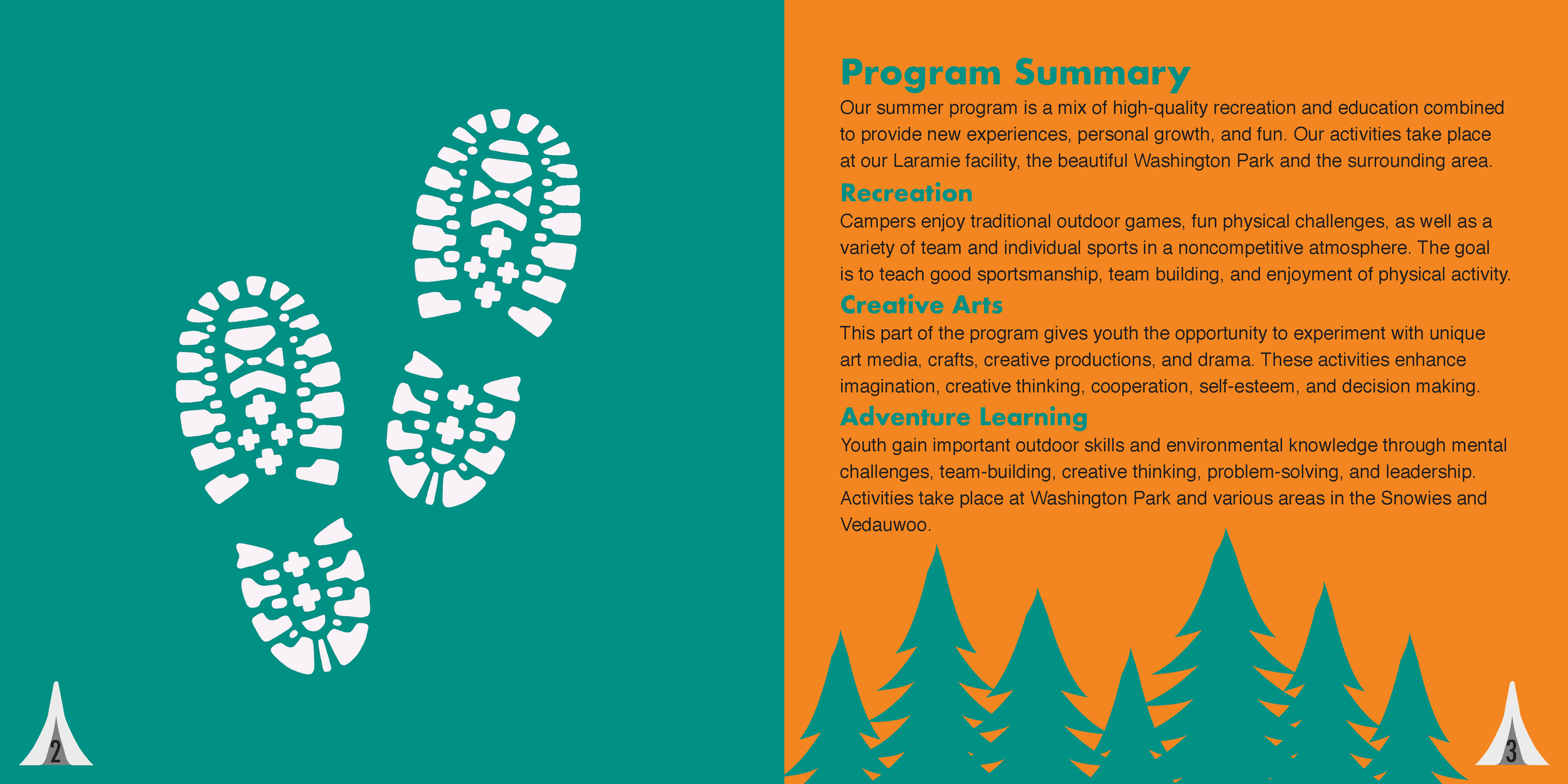

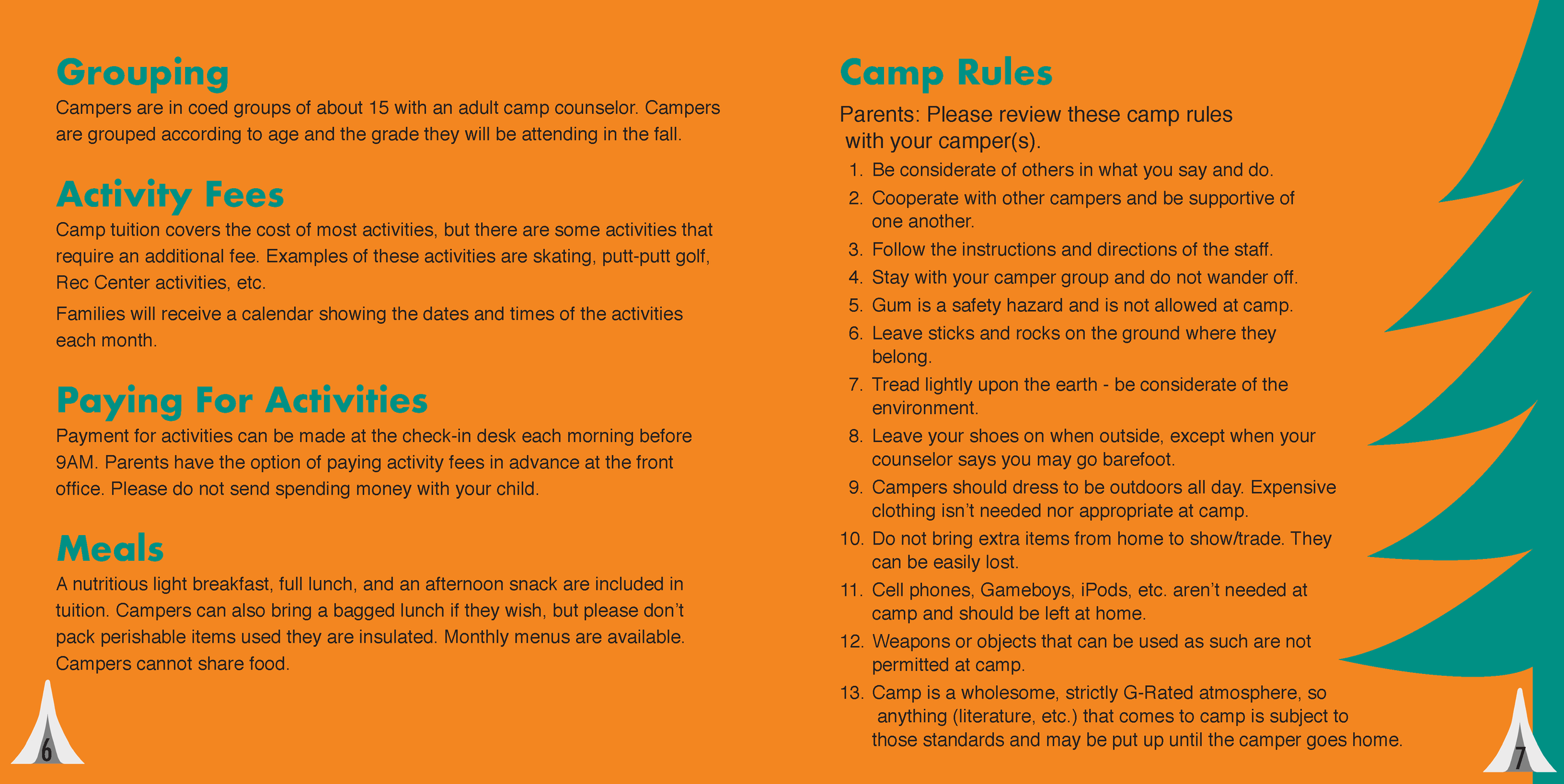

Composition 2


Composition 3

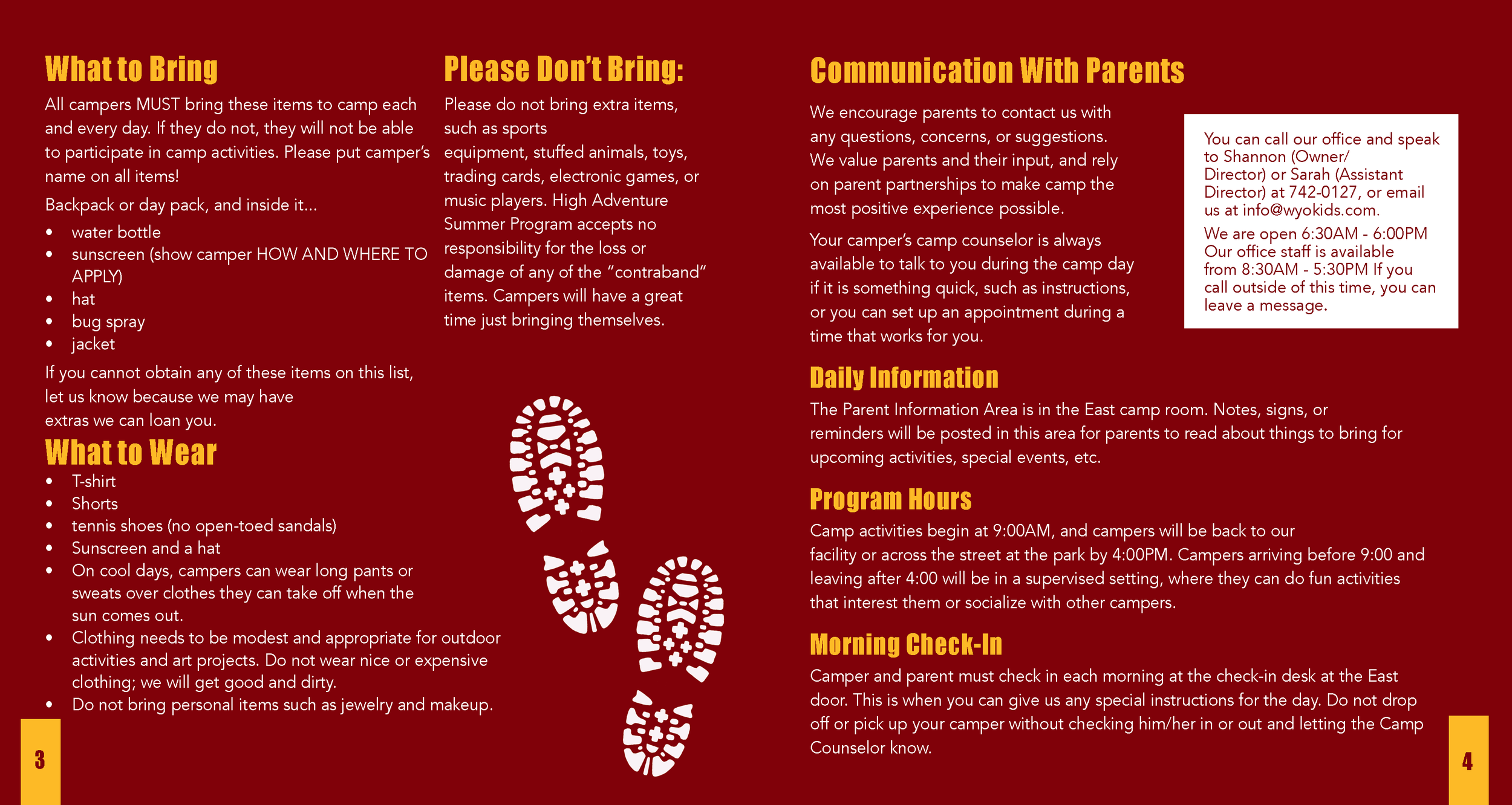
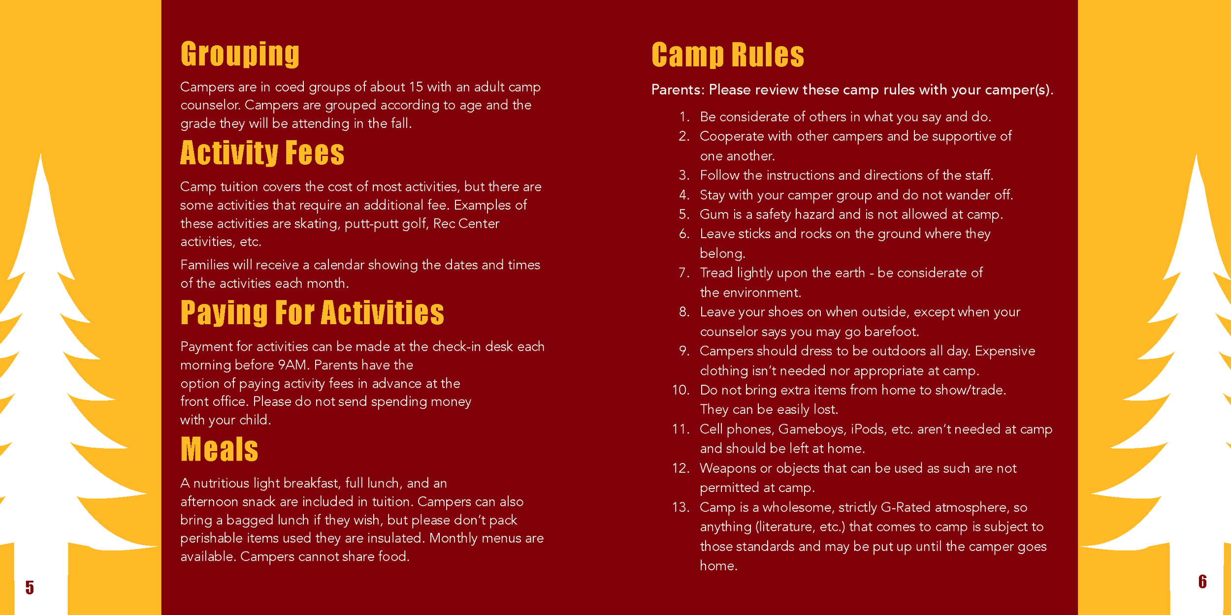
After these compositions were completed, I began user testing. I showed various people the designs to get their reactions and opinions. The users decided they liked the look of the third composition the best. I gathered critiques from the users to see what they would like to see changed. Some notes were to make the colors more youthful, use a new typeface for the body, track the headlines, make the cover more inviting, and lighten up “Youth Program.” I agreed with all these notes. The third design felt very mature and since it was a day camp for children, it needed to be more fun and inviting.
the solution
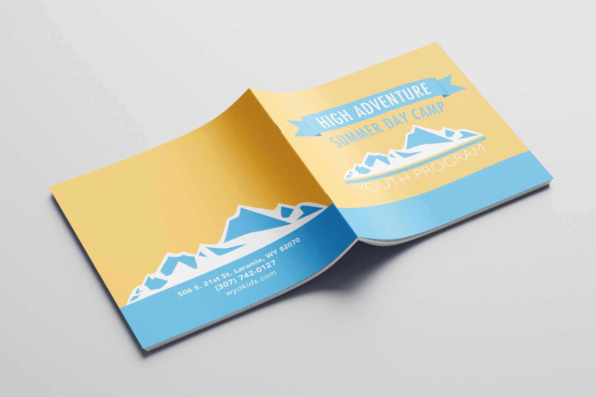
To make the colors more youthful I decided to go with a gold/yellow and light blue design. It is a day camp so having colors that reflect the sun and blue sky was more fitting for the brochure. The cover itself was changed a lot. Adding the banner and using a lighter typeface felt more welcoming than just the mountain landscape. The type itself is organized and spaced out to improve readability. Users can now scan the brochure and easily find the information they need. Overall, the redesign will attract more campers than the one previously published.
the impact
The redesign hopefully would be used to raise the number of campers attending High Adventure Summer Day Camp. To measure the impact of the design, I went back to the users from the user testing stage. They liked the design and saw the improvement from the original.
This was my first time designing a brochure, so this project was important in my typography skills. I had to carefully lay out each page in order to organize the information effectively. Choosing the typeface was also an instrumental part of this project, so putting time into that was very impactful to my design techniques. I have designed various booklets and brochures after this project, and I have since improved my work. I always think back to this project as it was one of the first designs I have ever worked on.


