Type Specimen Booklet
⋆
Type Specimen Booklet ⋆
the problem
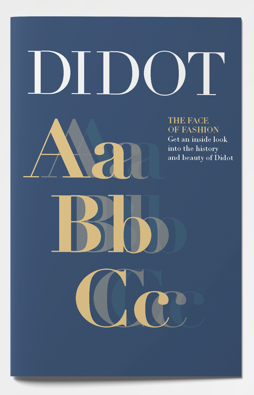
The project was to create a type specimen booklet. The purpose of this booklet was to examine a typeface in detail, researching its origin, etc. This is an opportunity to teach myself more about a typeface that I have used in the past. As a designer it is important to know about the materials you are using. This booklet can also be used to educate the people reading it.



the process
Choosing a typeface to focus on was the first step in this process. By creating a document with a compilation of multiple typefaces, I was able to decide which one seemed the most appealing to me. I finally landed on Didot.
In the ideation phase, sketching out layouts was top priority. Throughout my research, I discovered that the Vogue cover and logo used Didot, so I had the idea of basing a design off a magazine design. Color studies were then completed to decide what theme would work best for Didot. I knew I wanted a more sophisticated look because that was the aesthetic of the typeface.
The next step was research. Researching the history of Didot, where it is used, type pairings, etc. Visual research was completed to see how other designers have set up type specimen booklets in the past.
Before deciding on a final layout, three compositions were made. The first composition included the magazine spread design and used navy blue, gold, and white. The second composition was a square booklet with a tan and green color palette. The design included big letters for emphasis. The third composition included “Didot” repeating in different styles with a pink, black, and white color palette on a square document.
Composition 1 Cover
Composition 1 Inside Pages 1&2
Composition 1 Inside Pages 3&4
Composition 1 Inside Pages 5&6
Composition 1 Inside Pages 7&8
Composition 1 Back Cover
Composition 2 Cover
Composition 2 Inside Pages 1&2
Composition 2 Inside Pages 3&4
Composition 3 Cover
Composition 3 Inside Pages
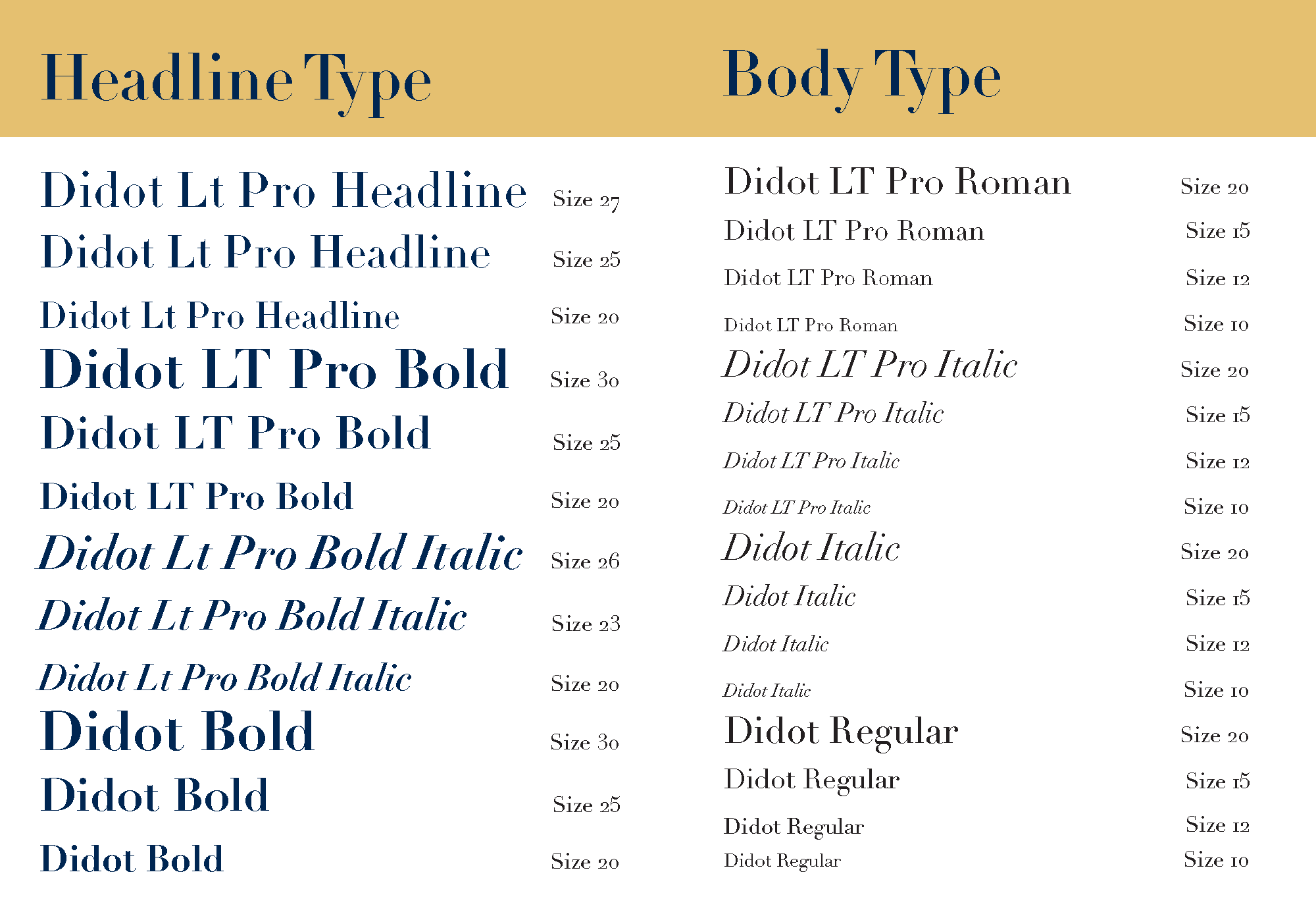
After critiques, the magazine layout was the strongest and was the design that should be continued and finalized. Some changes that needed to be made included moving the type examples to look like a table of contents, include type pairings, make the heading bold on the cover, and track the ‘O’ and ‘T’ on the cover.
the solution
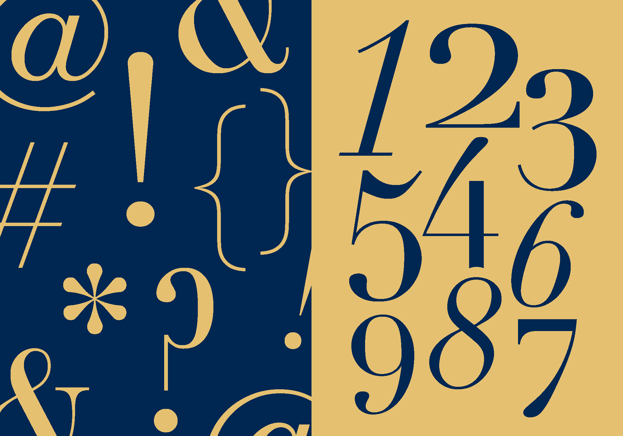
At the end of this project, the final project was a 20-page spread including a full analysis and history of the Didot. I chose to continue with the magazine design because it represented the typeface and the importance it has in our society. This booklet includes most of the information a person would need to know about the typeface and the best way to use it.






the impact
This project was educational to me in the set-up of a booklet from a design aspect. It was also educational because I was researching and analyzing a specific typeface like never before. I have done type studies in the past, but only based on the appearance of it in context of what project I was working on.


