Calendar Design
⋆
Calendar Design ⋆
the problem
Design a poster for Harry Styles: Love On Tour that showcases all the dates of the tour. The poster needed to be well organized so the people attending the concert could easily read it and know his schedule. The problem was that there were many shows, which made it difficult to format it properly. The poster also needed to entice people to want to buy tickets to the show. The design of the poster needed to be a product that the audience would want to buy to keep as a souvenir.
Final Mockup 1
Final Mockup 2
The first step in the process was to gather all the information that needed to be on the poster. This included show dates, places where he was performing, special guests, etc. Research was the next step in the process, particularly audience research, visual research, and competitive analysis. I wanted to look at Styles’ past posters and images to decide on the style of the calendar. Throughout the visual research I found that designs for his brand are either bright fun colors or a sleek rock and roll look. Looking at other tour posters was key to the design process to see what other artists have done in the past.
the process
This opened the door up to many ways I could approach the design. I focused more on the images he was using previously to promote the tour and saw he was using the colors pink and blue. Styles was also using an image showcasing a white boot and wide leg pants. I then took photos of myself recreating some of the poses and editing the images to alter the colors.
When it came time to design the poster, I first started by sketching out various layouts and doing color and type studies. Choosing the typeface was the most important as readability and hierarchy of information was the focus of this project.
Original Sketches
The first composition included the typeface Frutiger Ultra Black for the header and Frutiger Black for the body copy. This also included a paper texture overlay.
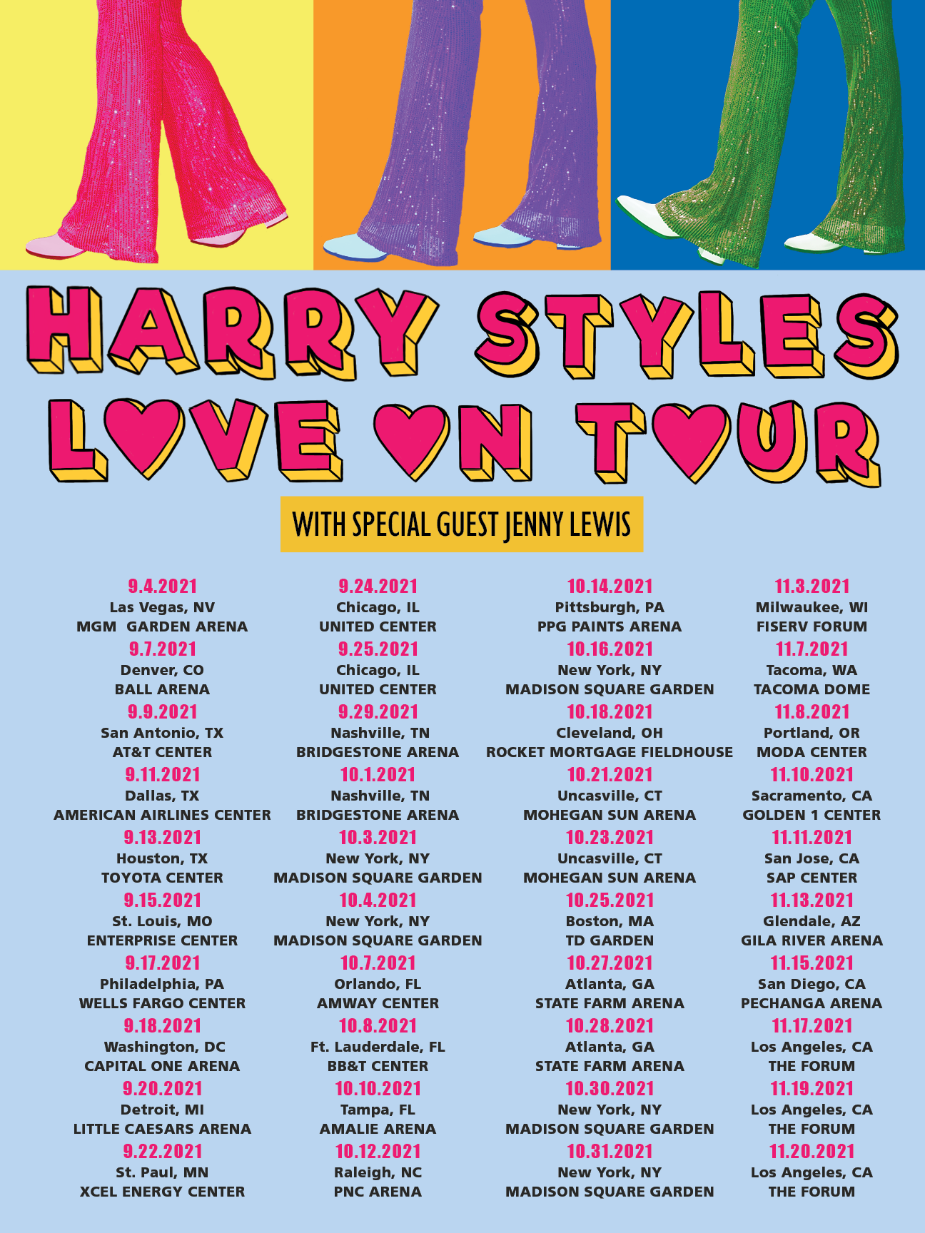
The second composition was a disco fun aesthetic. The header was hand drawn type and the body copy was Impact for the dates and Frutiger black for the locations.
Composition 1
Composition 2
The third composition had a more rock and sleeker look than the others. It included Gill Sans Nova Condensed ExtraBold for the heading and the same typeface outlined for the special guest. The body copy was also Impact for the dates and Frutiger black for the locations.
Composition 3
I got feedback on all of the compositions from my peers and revised them. I took notes on each design and chose which ones to move forward with.
Composition 2 Notes
Composition 3 Notes
the solution
I chose to finalize two out of the three compositions because I could not choose a favorite. For the colorful design, I made sure the type style was consistent, I lightened the background, changed the shape of the background for the special guest, and made the text smaller. For the black and pink style I changed the placement of the headers, changed the position of the image, and made the type consistent.
I found that the two versions reflected the tour in general. During the research process, it was shown that Harry is versatile and has two sides to him. The tour posters reflect that, and both solved the readability issue. The two versions also ensured everyone would buy a poster because there is a version for each fan’s aesthetic.
Final 1
Final 2
the impact
Since this project, I have improved my design skills and often think about this project, as it is one of my favorites. Some key takeaways from this project are:
How difficult it can be to organize this much information on a single page
How much of an impact an image can make on a design
The importance of research before designing
After presenting the posters and posting them for reactions, they were well received by fans. They liked the design and wanted to purchase them for themselves.


